Jaguar, a brand synonymous with luxury and automotive prestige, has recently unveiled a new logo as part of a significant brand identity overhaul. This isn’t just a minor tweak; it’s a radical reimagining aimed at propelling the marque into a new era. While the ambition is commendable – Jaguar undeniably needed a refresh – the execution, particularly the new logo, has sparked a wave of criticism and debate. Is this a necessary evolution for the British automaker, or a misstep that dilutes its iconic image? Let’s delve into the details of Jaguar’s new logo and the broader brand identity shift to understand the reactions and assess its potential impact.
The Need for Change at Jaguar
There’s a general consensus that Jaguar was in need of a brand refresh. Despite a rich history and a portfolio of stunning vehicles, the brand had arguably become somewhat stagnant in recent years. In a competitive luxury car market dominated by German giants and emerging electric vehicle brands, simply relying on past glories isn’t a sustainable strategy. To attract a new generation of buyers and effectively compete, Jaguar needed to modernize its image and messaging. This rebrand is clearly an attempt to address this challenge, signaling a move towards a more contemporary and forward-looking identity, especially as they transition towards an all-electric future.
Introducing the New “Device Mark” Logo
The centerpiece of this rebranding effort is the new wordmark logo, what Jaguar terms a “device mark.” Gone is the classic, somewhat formal typography of the previous logo. In its place is a rounded, mixed-case typeface that feels decidedly more playful and approachable. The designers have opted for a clean, sans-serif font, and the lowercase “j” and “a” contribute to a softer, more contemporary aesthetic. Some observers have noted a retro vibe, reminiscent of 1970s design trends. While on a basic design level, the logo isn’t inherently flawed – the rounded forms are indeed friendly and clean – the question is whether it’s the right fit for the Jaguar brand. It might work well for a tech gadget company or a trendy food brand, but does it convey the luxury, sophistication, and heritage expected from a marque like Jaguar?
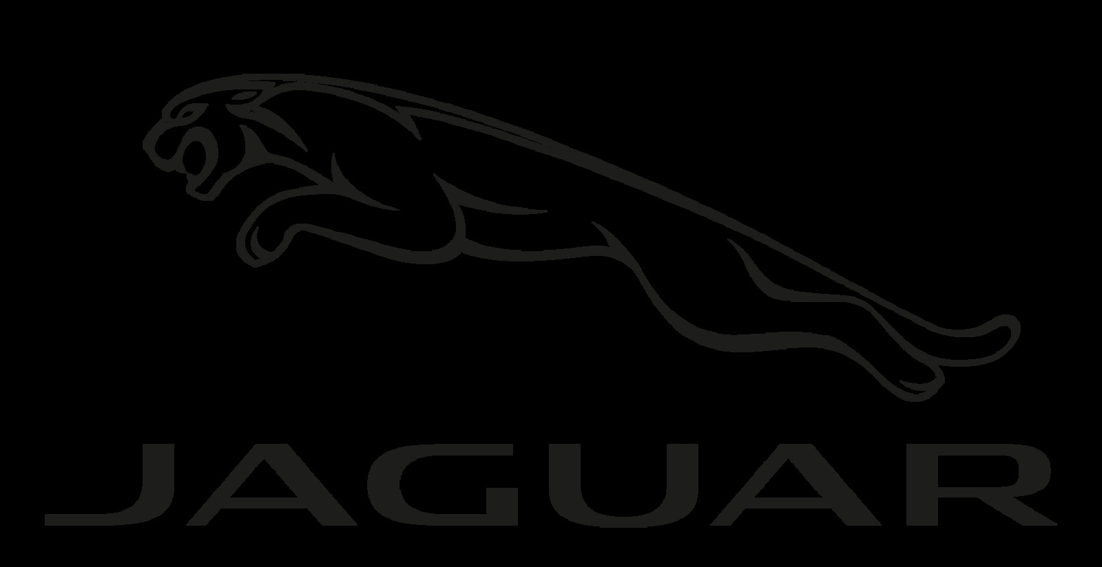 Jaguar's previous logo featuring the iconic leaping jaguar and classic typography.
Visual Comparisons and Brand Perception
The internet reacted swiftly, and many pointed out the visual similarities between Jaguar’s new logo and logos from completely unrelated brands. Comparisons to Nintendo’s e-Reader toys, the typography used for the movie Dune, and even the Bloomingdale’s department store logo quickly surfaced. These comparisons highlight a crucial issue: brand perception. Does the new logo evoke the desired associations for a luxury car brand? Does it communicate exclusivity, performance, and refined British elegance? For many, the answer appears to be no. The visual associations with toys, science fiction, and department stores arguably undermine Jaguar’s position as a premium vehicle manufacturer competing with the likes of Rolls-Royce, Mercedes-Benz, and Bentley.
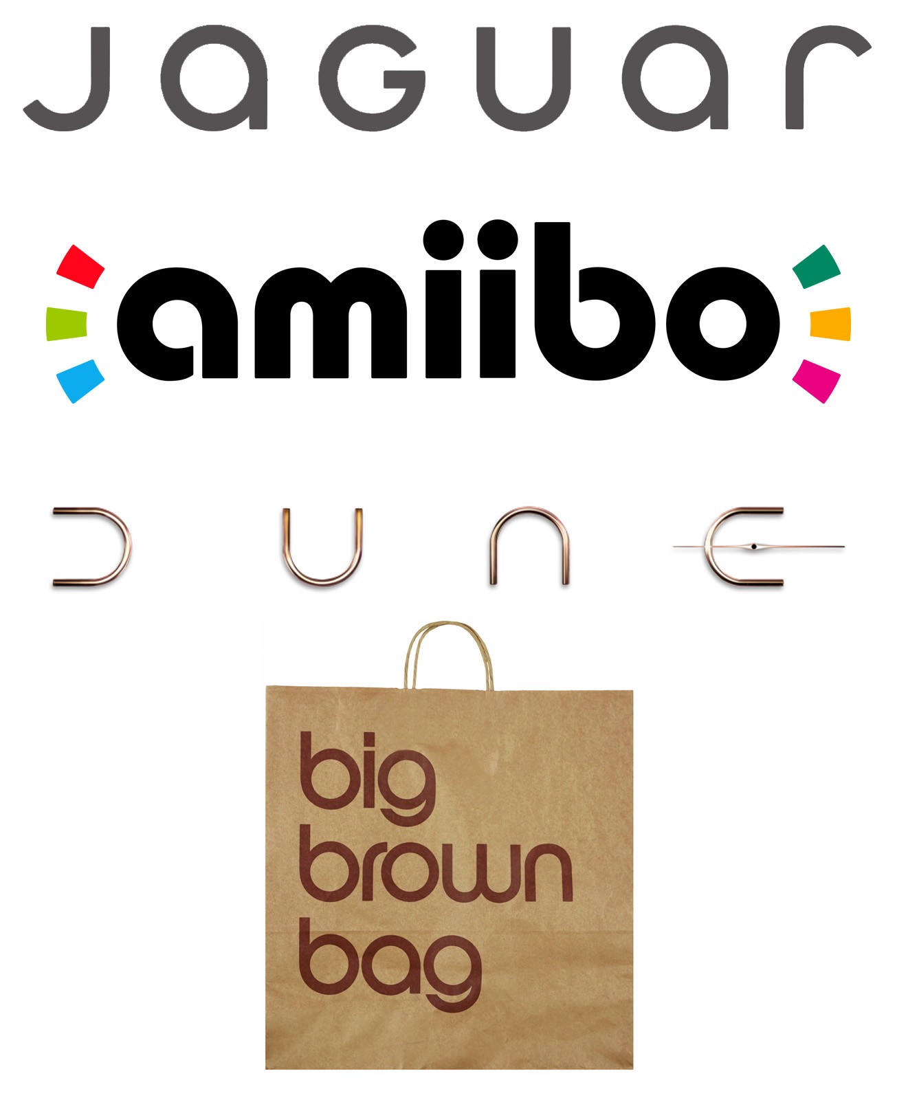 Visual comparison of Jaguar's new wordmark logo with logos from Nintendo e-Reader, Dune movie, and Bloomingdale's, highlighting perceived similarities.
Where’s the Leaping Jaguar?
Perhaps the most significant point of contention is the near-disappearance of the iconic leaping jaguar. For decades, the “leaper” has been a symbol inextricably linked with the brand, embodying speed, agility, and power. While not entirely absent from the new brand identity, it has been relegated to a secondary “makers mark.” This stylized leaping jaguar is intended for use in specific applications, such as grilles or as a badge, and is set against a striped background Jaguar calls “strikethrough.” While this “makers mark” is arguably more visually appealing than the wordmark for many, its diminished role in the primary logo feels like a significant loss. The leaping jaguar was a unique and instantly recognizable symbol; its reduced prominence weakens the brand’s visual identity and connection to its heritage.
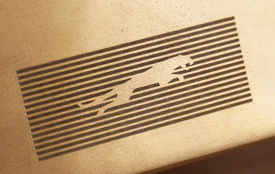 Jaguar's new "makers mark" logo, a stylized leaping jaguar intended for use as a secondary brand element.
Jaguar also introduced a monogram logo, featuring a stylized “JR” for “Jaguar Reimagined.” This monogram, while potentially useful for certain applications, further dilutes the focus on the more recognizable jaguar imagery.
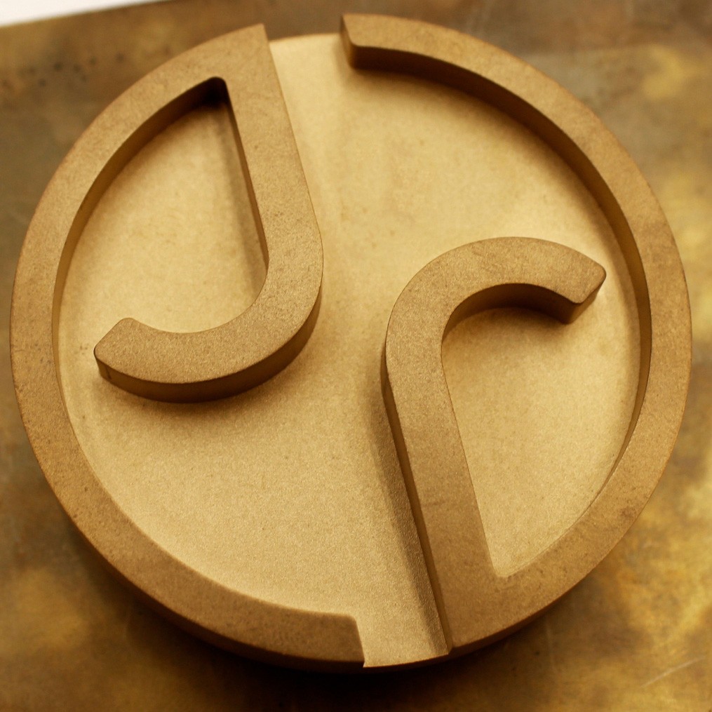 Jaguar's monogram logo, featuring a stylized 'JR' for Jaguar Reimagined, part of the new brand identity.
The Broader Brand Identity Campaign
Beyond the logo, the broader brand identity campaign, with its tagline “Copy Nothing,” has also faced criticism for being derivative. The campaign visuals feature bold, colorful couture and monochromatic backgrounds, an aesthetic that, while visually striking, is hardly groundbreaking. Critics argue that this style is a well-worn trope for brands attempting to project an image of edginess and innovation. Reverse image searches of campaign visuals reveal numerous examples of similar aesthetics dating back years, suggesting a lack of originality in Jaguar’s attempt to appear “fearless, exuberant, [and] compelling,” as they describe it.
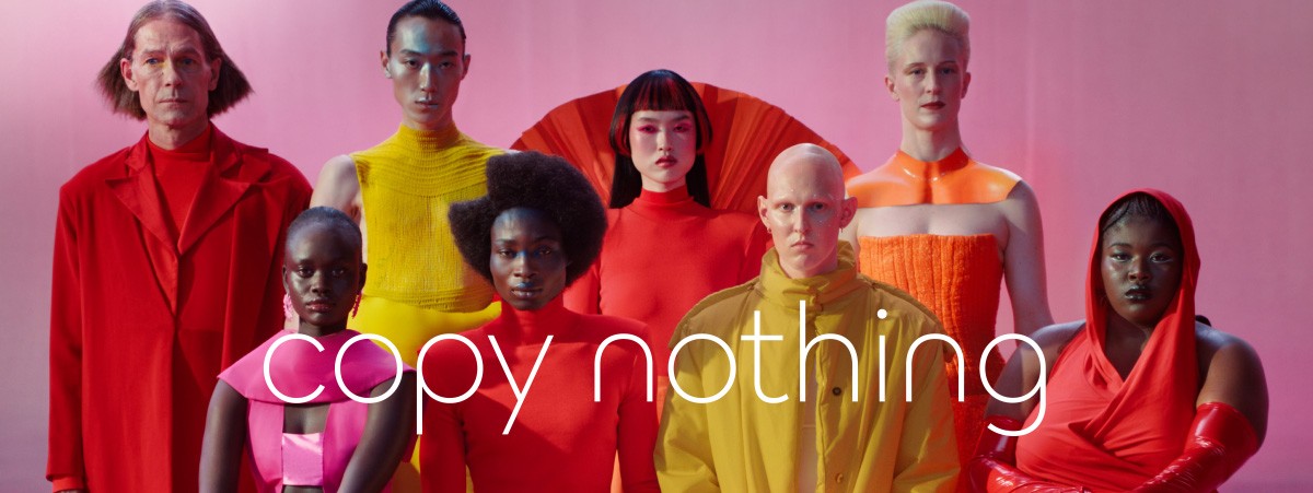 Jaguar's "Copy Nothing" brand campaign imagery featuring unconventional models in colorful, bold fashion.
The campaign’s attempt at shock value and artistic expression is further undermined by comparisons to past campaigns. One particular image, featuring a model with a sledgehammer, drew immediate parallels to Apple’s iconic 1984 advertisement, highlighting a lack of truly original creative direction.
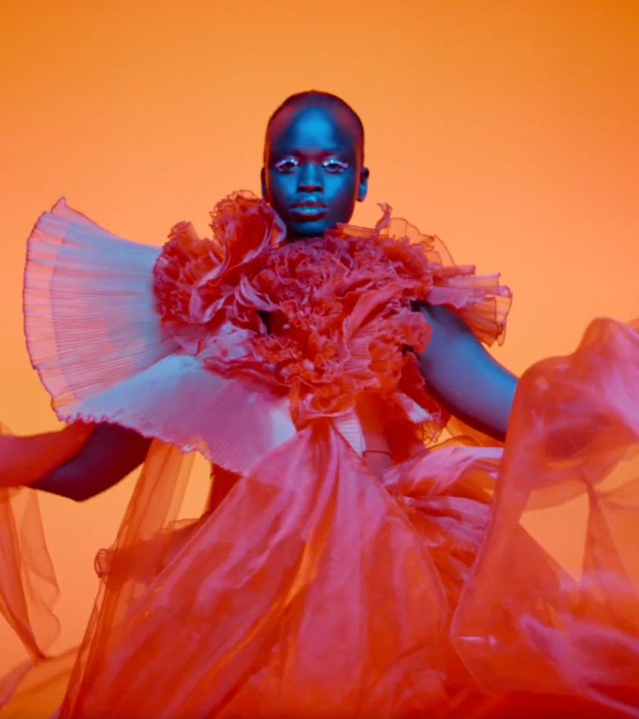 Detail of a model from Jaguar's new brand campaign, showcasing the bold and colorful aesthetic criticized as derivative.
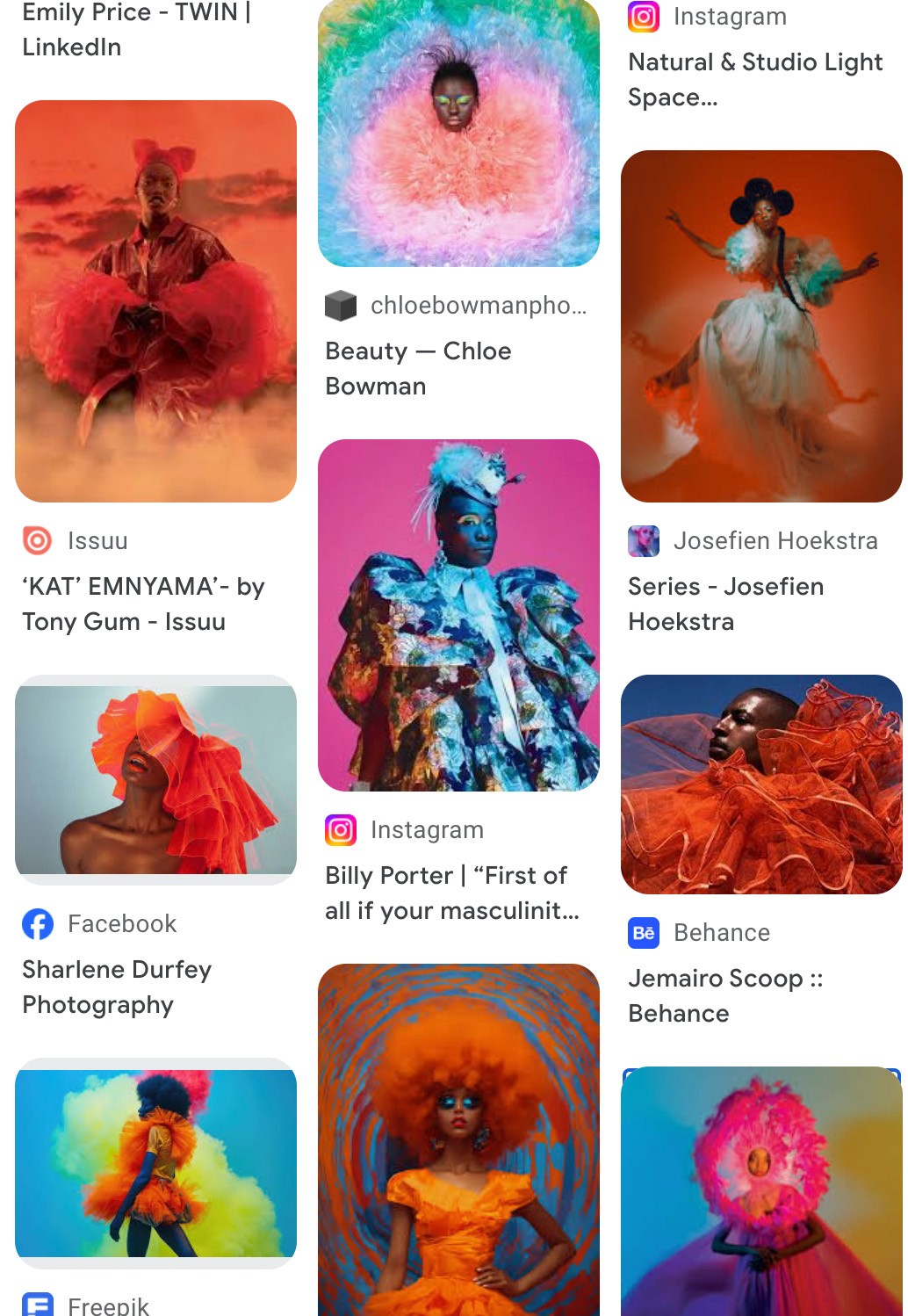 Examples of fashion and branding aesthetics similar to Jaguar's new campaign, illustrating the argument that the "Copy Nothing" approach is not original.
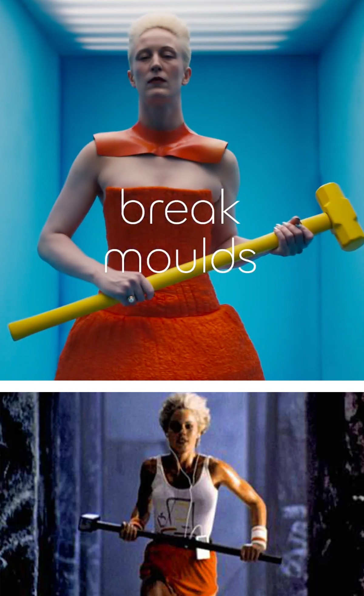 A model with a sledgehammer from Jaguar's campaign, drawing comparisons to Apple's iconic 1984 advertisement in terms of its intended impact.
A Missed Opportunity for Innovation and Appeal
While aiming for an artistic and unexpected approach is commendable, the execution of Jaguar’s new brand identity seems to miss the mark. Unlike successful artistic campaigns, such as those seen from Citroën in the past, there’s a perceived lack of joy and genuine innovation. The tone comes across as overly serious, even smug and elitist, potentially alienating a broader audience. The campaign’s confrontational stance against some undefined “ordinary” feels forced and lacks the playful charm that could have made it more appealing.
 GIF of Grace Jones in a Citroën commercial, used as an example of successful artistic car advertising, contrasting with Jaguar's campaign.
The question remains whether this new branding will resonate with consumers. While it has certainly generated discussion, much of it is negative. The risk is that instead of attracting new customers, Jaguar’s new logo and brand identity will alienate loyalists and fail to establish a compelling new vision for the brand.
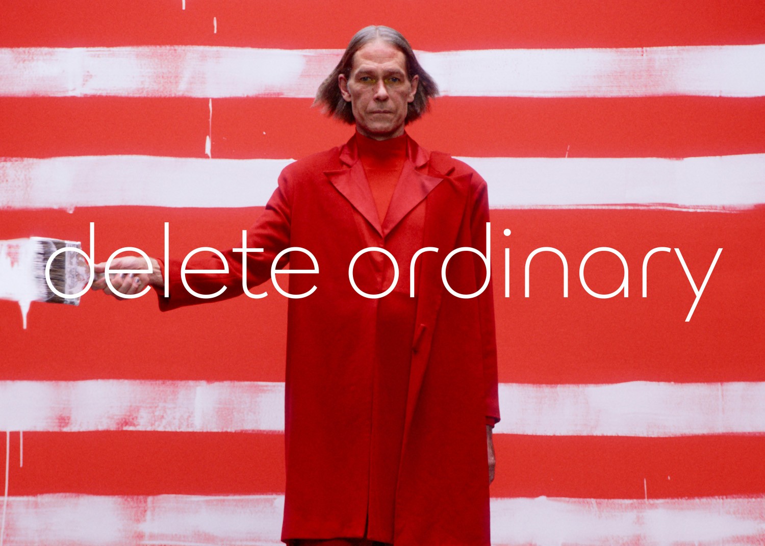 "Delete Ordinary" campaign image, portraying a model with a confrontational and serious demeanor, criticized for being smug and elitist.
Conclusion
Jaguar’s desire to reinvent itself and modernize its brand is understandable and, arguably, necessary. However, the initial reception to Jaguar’s new logo and overall brand identity campaign suggests a significant misstep. While the intention may have been bold and innovative, the result appears derivative, lacking in genuine appeal, and potentially damaging to the brand’s established image of luxury and sophistication. Perhaps a reconsideration, or at least a refinement, of this new direction is in order for Jaguar to truly capture the hearts and minds of the modern luxury car buyer.